
Software-based AE systems are able to generate graphical displays for analysis of the signals recorded during AE inspection. These displays provide valuable information about the detected events and can be classified into four categories: location, activity, intensity, and data quality (crossplots).
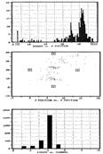
Location displays identify the origin of the detected AE events. These can be graphed by X coordinates, X-Y coordinates, or by channel for linear computed-source location, planar computed-source location, and zone location techniques. Examples of each graph are shown to the right.
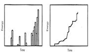
Activity displays show AE activity as a function of time on an X-Y plot (figure below left). Each bar on the graphs represents a specified amount of time. For example, a one-hour test could be divided into 100 time increments. All activity measured within a given 36 second interval would be displayed in a given histogram bar. Either axis may be displayed logarithmically in the event of high AE activity or long testing periods. In addition to showing measured activity over a single time period, cumulative activity displays (figure below right) can be created to show the total amount of activity detected during a test. This display is valuable for measuring the total emission quantity and the average rate of emission.

Intensity displays are used to give statistical information concerning the magnitude of the detected signals. As can be seen in the amplitude distribution graph to the near right, the number of hits is plotted at each amplitude increment (expressed in dB’s) beyond the user-defined threshold. These graphs can be used to determine whether a few large signals or many small ones created the detected AE signal energy. In addition, if the Y-axis is plotted logarithmically, the shape of the amplitude distribution can be interpreted to determine the activity of a crack (e.g. a linear distribution indicates growth).
The fourth category of AE displays, crossplots, is used for evaluating the quality of the data collected. Counts versus amplitude, duration versus amplitude, and counts versus duration are frequently used crossplots. As shown in the final figure, each hit is marked as a single point, indicating the correlation between the two signal features. The recognized signals from AE events typically form a diagonal band since larger signals usually generate higher counts. Because noise signals caused by electromagnetic interference do not have as many threshold-crossing pulses as typical AE source events, the hits are located below the main band. Conversely, signals caused by friction or leaks have more threshold-crossing pulses than typical AE source events and are subsequently located above the main band. In the case of ambiguous data, expertise is necessary in separating desirable and unwanted hits.