Pareto Diagram
Alfredo Pareto (1848-1923) conducted extensive studies of distributions of wealth in Europe. He found that there were a few people with a lot of money and many people with little money. This unequal distribution of wealth became an integral part of economic theory. Dr. Joseph Juran recognized this concept as a universal truth that could be applied to many fields. He coined the phrases “vital few” and “useful many.”
In restaurant quality problems, the activity could be customer complaints and the factor could be “discourteous customer.” For a manufacturer, the activity could be product defect and a factor could be “missing product.” Pareto concept, called the 80/20 rule, is that 80 percent of the activity is caused by 20 percent of factors. By concentrating on the 20 percent of the factors (the vital few), a manager can attack 80 percent of the quality problems.
Examples of the vital few are as follows:
i) A few customers account for the majority of sales.
ii) A few processes account for the bulk of the scrap or rework cost.
iii) A few nonconformities account for the majority of customer complaints.
iv) A few suppliers account for the majority of rejected parts.
v) A few problems account for the bulk of the process downtime.
vi) A few products account for the majority of the profit.
vii) A few items account for the bulk of the inventory cost.
Some Sample 80/20 Rule Applications
i) 80% of process defects arise from 20% of the process issues.
ii) 20% of your sales force produces 80% of your company revenue.
iii) 80% of delays in schedule arise from 20% of the possible causes of the delays.
iv) 80% of customer complaints arise from 20% of your products or services.
(The above examples are rough estimates.)
The few vital factors can be identified with a Pareto chart or diagram, a bar chart on which the factors are plotted in decreasing order of frequency along the horizontal axis. The chart has two vertical axes, the one on the left showing frequency (as in a histogram) and the one on the right showing the cumulative percentage of frequency. The cumulative frequency curve identifies the few vital factors that warrant immediate managerial attention.
Construction
i) Determine the categories and the units for comparison of the data, such as frequency, cost or time.
ii) Total the raw data in each category and then determine the grand total by adding the totals of each category.
iii) Reorder the categories from largest to smallest.
iv) Determine the cumulative percent of each category (i.e. the sum of each category plus all categories that precede it in the rank order, divided by the grand total and multiplied by 100).
v) Draw and label the left-hand vertical axis with the unit of comparison, such as frequency, cost or time.
vi) Draw and label the horizontal axis with the categories. List from left to right in rank order.
vii) Draw and label the right-hand vertical axis from 0 to 100 percent. The 100 percent should line up with the grand total on the left hand vertical axis.
viii) Beginning with the largest category, draw in bars for each category representing the total for that category.
ix) Draw a line graph beginning at the right-hand corner of the first bar to represent the cumulative percent for each category as measured on the right hand axis.
x) Analyse the chart. Usually, the top 20% of the categories will comprise roughly 80% of the cumulative total.
Example– Pareto Chart for a Restaurant
The manager of a neighbourhood restaurant is concerned about the smallest numbers of customers patronizing his eatery. The numbers of complaints have been rising of late. He would like some means of finding out what issues to address and of presenting the findings in a way his employees can understand them.
Solution
The manger surveyed his customers over several weeks and collected the following data:
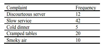
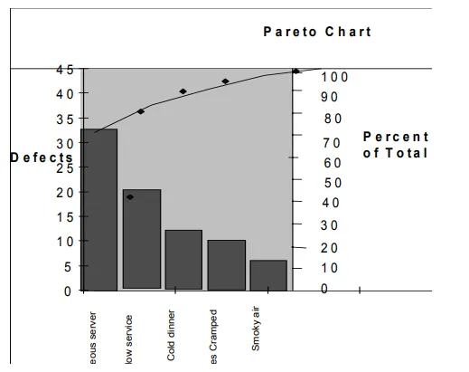
Figure– Pareto chart
Decision
It was clear to the manager and all employees which complaints, if rectified, would cover most of the quality problems in restaurant. First, slow service will be addressed by training the existing staff, adding another server and improving the food preparation process. Removing some decorative, but otherwise unnecessary, furniture from dining area and spacing the tables better will solve the problems with cramped tables. The Pareto chart shows that these two problems, if rectified, will account for almost 70 percent of the complaints.
Some possible uses could include the following:
i) Hotels– Customer complaints at reception, noise levels in rooms, heating in rooms etc.
ii) Accidents and injuries– Fractures, eye and foreign bodies, muscle injuries, back injuries, burns, cuts, bruises etc.
Process Flow Diagram
Purpose
A flowchart is a pictorial representation of the steps in a given process. The steps are presented graphically in sequence so that team members can examine the order presented and come to a common understanding of how the process operates.
Flowcharts can be used to describe an existing process or to present a proposed change in the flow of a process. Flowcharts are the easiest way to “picture” a process, especially if it is very complex. Flowcharts should include every activity in the process. A flowchart should be the first step in identifying problems and targeting areas for improvement.
Steps in Flowcharting a Process
1. Decide on the process of flowchart.
2. Define the boundaries of the process– the beginning and the end.
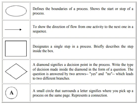
3. Describe the beginning step of the process in an oval.
4. Ask yourself ”what happens next?” and add the step to the flowchart as a rectangle. Continue mapping out the steps as rectangles connected by one-way arrows.
5. When a decision point is reached, write the decision in the form of a question in a diamond and develop the “yes” and “no” paths. Each yes/no path should re-enter the process or exit somewhere.
6. Repeat steps 4 and 5 until the last step in the process is reached.
7. Describe the ending boundary/step in an oval.
When drawing a flowchart, constantly ask “what happens next,” “is there a decision made at this point,” “does this reflect reality,” “who else knows this process” etc. When possible, do a walkthrough of the process to see if any steps have been left out or extras added that should not be there. The key is not to draw a flowchart representing how the process is supposed to operate, but to determine how it actually does operate. A good flowchart of a bad process will show how illogical or wasteful some of the steps or branches are.
The best way to illustrate the use of these guidelines is to look at a simple example (see below) and follow how each step has been applied.
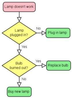
1. The first step is to identify the process to be flowcharted and to give the chart a title. In this case, it is “how to fill the car’s petrol tank.”
2. Begin to draw the chart by first describing the event which initiates the process (the “trigger”). In the example, this is “low petrol warning light comes on.”
3. Then note down each successive action taken. Actions should be described in as few words as possible, but make sure the description is not ambiguous or unclear.
4. When you reach a point at which the flowchart branches into a number of alternatives and the resulting complexity threatens to overwhelm the exercise, choose the most important alternative to continue flowcharting with. The others can simply be terminated and dealt with in separate flowcharts. Such a point is illustrated in the example where a decision is required on how much petrol is to be put in the tank.
5. Often you may need to make cross-references to important supporting information (in this example, cross references may be made to, say, a table of preferred brands of petrol, or to a list of cars able to use unleaded petrol).
6. Continue describing each event, action or decision as it occurs in sequence, until the process is concluded. In the example, this point is reached when the petrol is paid for, the tank is recharged, and you are ready to drive off.
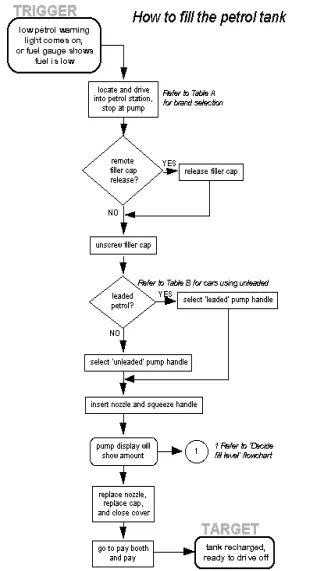
Figure 21.2– Process flow diagram
Flowcharts help to identify all the key tasks involved. The finished chart can be used for the following purposes:
· As a springboard for further discussion of the process
· To connect with other flowcharts explaining related activities
· To identify points where data can be usefully collected and analysed
· To isolate possible problem areas
· To communicate the process to those unfamiliar with it
Symbols in a Flowchart
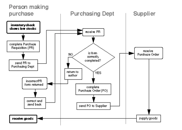
Tracking “Handovers”
When a flowchart describes a process in which a number of different people, departments or functional areas are involved, it is sometimes difficult to keep track of who is responsible for each step. A useful additional technique for tracking this and for analysing the number of times a process is “handed over” to different people is to divide the flowchart into columns. Head up each column with the name of the person or function involved in the process. And each time they carry out an action, show it in their column. This is illustrated in the flowchart below which covers a simple purchasing process. It shows how control of the process passes from the person initiating the purchase to the purchasing department and then to the supplier.